The Perfect Balance: Symmetry and Brilliance in the Asscher Cut
The Asscher cut is funny that way. It’s clean, geometric, and almost stubbornly “not trendy.” It doesn’t do that glittery, confetti-style sparkle you see everywhere right now. Instead, it gives you crisp symmetry and that famous hall-of-mirrors look. And somehow, it keeps coming back decade after decade, looking just as current on the hand as it did a century ago.
In this article, I’m going to break down what makes an Asscher cut diamond ring feel so balanced, and why that balance is not just a visual preference. It is the core of how the stone performs. We’ll talk about symmetry, brilliance, and transparency. We’ll also get practical about what to look for when you’re shopping, which specs matter, and which ones are distractions.
By the end, you’ll know how to choose an Asscher that actually looks great in real life, not just on a grading report. And if you want to compare options the right way, I’ll also show you how to try Asscher cuts in person with me at Mike Nekta New York, where you can see patterning, color, and clarity side by side.
What an Asscher Cut Diamond Really Is (And How It Differs From Emerald Cut)
An Asscher cut is a square step-cut diamond with cropped corners. If you look at a well-cut Asscher from the top, you’ll usually see a strong, centered pattern that looks like concentric squares stepping down into the stone. People often call it a windmill or kaleidoscope effect. That pattern is not a bonus feature. It is the point.
Step-cut vs brilliant-cut (why the sparkle looks different)
Most diamonds people picture are brilliant cuts, like rounds. Those are designed to throw lots of small sparkles in many directions. Step cuts (Asscher and emerald) are built differently. They have long, flat facets, and those facets act like mirrors. Instead of tiny glitter, you get:
- Bigger flashes of light
- Cleaner on/off contrast (light and dark)
- A more “glassy,” architectural look when the stone is high quality
This is also why step cuts tend to show clarity and color more easily. There is less facet “noise” to hide anything.
Asscher cut vs emerald cut
Asscher and emerald are both step cuts, so the vibe overlaps. The key difference is the shape and the way your eye reads the pattern.
- Emerald cut is rectangular and elongated. It’s elegance, length, and a sleek look across the finger.
- Asscher cut is square (or close to square), often deeper, and can create a more centered, hypnotic pattern when cut precisely.
When each looks best:
- Choose an Asscher if you like architectural design, vintage-meets-modern styling, and a bold, centered presence.
- Choose an emerald if you want elongated elegance and a more linear, runway-style look.
One more thing clients notice when they try them on: an Asscher cut diamond ring can look bolder than its carat weight suggests in terms of visual impact, even though the face-up size can be smaller than a round of the same carat. The patterning and depth give it a kind of “presence” that reads as substantial.
The “Perfect Balance”: Symmetry + Brilliance + Transparency
When people say an Asscher looks “perfect,” what they are usually reacting to is balance. Not just balance in the outline, but balance in performance.
Symmetry is not just aesthetics in an Asscher
In an Asscher, symmetry is the engine. The whole appeal is that the facets line up cleanly, the steps look even, and the center pulls your eye in. When the symmetry is excellent, the reflections look intentional and crisp. When it’s off, even slightly, the stone can look messy or dull, even if it has good carat weight and decent color.
A well-cut Asscher has that satisfying order to it. It looks calm and precise, almost like it was engineered.
What “brilliance” looks like in an Asscher
Brilliance in an Asscher is not about maximum sparkle. It’s about controlled light return. You should see:
- Larger, slower flashes (not scattered glitter)
- Strong mirrored reflections
- Clean contrast between bright and dark areas
That contrast is what gives the Asscher its personality. With precise cutting, the stone doesn’t look “busy.” It looks sharp.
Why transparency matters
Step cuts reveal more because they have broad, open facets. Think of them like windows and mirrors. If the material is hazy or included, you can lose that crispness fast. Transparency is the difference between an Asscher that looks like a clean pool of light and one that looks a little cloudy or sleepy.
Practical takeaway: Asscher shopping is about precision and purity, not just carat weight. If you chase size without respecting cut quality and clean material, the style that’s supposed to look elite can end up looking flat.
Clarity: Why Asscher Cuts “Tell the Truth” (And the Grades That Usually Make Sense)
Asschers tell the truth because they give you nowhere to hide. In a round brilliant, inclusions can get broken up by the sparkle. In a step cut, broad facets can reflect an inclusion again and again, and your eye catches it.
Practical clarity guidance (what usually makes sense)
Most buyers land in this range:
- VS2 to VVS2: usually the sweet spot for keeping the look clean without overspending
- SI1 or SI2: can work sometimes, but it depends heavily on the type of inclusion and where it sits
If you are considering SI clarity, it needs to be evaluated with real care. Two SI1 stones can look completely different. One can be a great value and appear clean face-up. The other can look obviously included and take away the entire Asscher effect.
Common inclusion issues I watch for in Asschers
Here are the ones that matter most in this cut:
- Crystals under the table: highly visible because the table is large and open
- Clouds: these can reduce transparency and make the stone look hazy
- Feathers near corners: corners matter for durability and for how clean the outline looks
How to judge clarity in real life
If you’re shopping online, ask for magnified images and video. Then confirm in person before you commit. When I’m evaluating an Asscher with a client, I always do a few simple checks:
- Look face-up first (normal viewing distance)
- Tilt the stone and see if anything “catches” your eye repeatedly
- Check it in multiple lighting environments, not just jewelry spotlights
Clarity is also connected to long-term wear. Corner protection from the setting can help, but I don’t like using a setting as a way to “hide” a major inclusion. A good setting should protect the stone and complement the design, not compensate for a problem.
Carat, Face-Up Size, and Proportions: Why Some Asschers Look Smaller (and How to Avoid That)
A common surprise: Asschers can look smaller than expected for their carat weight. That’s not because anything is wrong. It’s because many Asschers are cut deeper, and depth adds carat weight below the surface.
What to compare instead of just carat
When I help someone shortlist Asschers, I look at:
- Millimeter measurements (this is what your eye sees)
- Length-to-width ratio (classic Asscher is near 1.00)
If you want a traditional Asscher, stay close to square. If you prefer something slightly rectangular, that can be elegant too, as long as it looks intentional.
The “top-heavy vs deep” trade-off
- A deeper Asscher can show a more dramatic internal pattern and stronger concentric steps.
- But it may face up smaller.
There is no perfect number that works for everyone. The point is to compare the right thing. If size on the finger is your priority, start with millimeters. If pattern and depth are your priority, you might accept a slightly smaller face-up look for a more striking hall-of-mirrors effect.
Practical buying tip
Shortlist by millimeter size first, then evaluate cut quality and material grades (clarity and color). This keeps you from accidentally paying for hidden weight you can’t appreciate on the hand.
How to Evaluate an Asscher in Person (Lighting Tests That Reveal Cut Quality Fast)
Asschers are one of those cuts that are hard to judge from one perfect photo. They are about pattern, contrast, and clean reflections. That’s why I always encourage people to see them live if they can.
A simple lighting checklist
Here are the lighting environments I like to use, and what each one reveals:
- Daylight near a window: best for judging true color and overall transparency
- Office lighting: shows real-world performance and whether the stone looks lively day to day
- Spotlight jewelry lighting: can make almost anything look good, but it helps reveal the bold flashes and contrast when the cut is excellent
What to look for
In a strong Asscher, you’ll see:
- Crisp, concentric steps
- Even contrast (not chaotic, not dull)
- No dead-looking center
- Clean facet junctions (no mushy, blurred edges)
The tilt test
Tilt the diamond slowly. The pattern should stay coherent. You want it to feel like the reflections are moving in a controlled, geometric way.
Avoid stones that:
- Go dark too easily
- Look glassy and flat without contrast
- Seem to lose the pattern when you move them slightly
The finger test
Asschers are very “orientation sensitive” on the hand. When you try one on, check:
- How the corners align relative to your finger
- Whether the setting frames the stone cleanly
- Whether the overall look feels balanced from every angle
This is also where you decide if you want the Asscher to feel bold and architectural, or softer and more vintage. The same stone can give a different impression depending on setting style, prongs, halo design, and band width.
Book an Appointment With Mike Nekta New York (See Asscher Cuts the Right Way)
If you’ve made it this far, you already understand the real challenge with Asscher cuts. The best ones are not just “good on paper.” They have subtle visual cues that are hard to fully capture in photos, even with video.
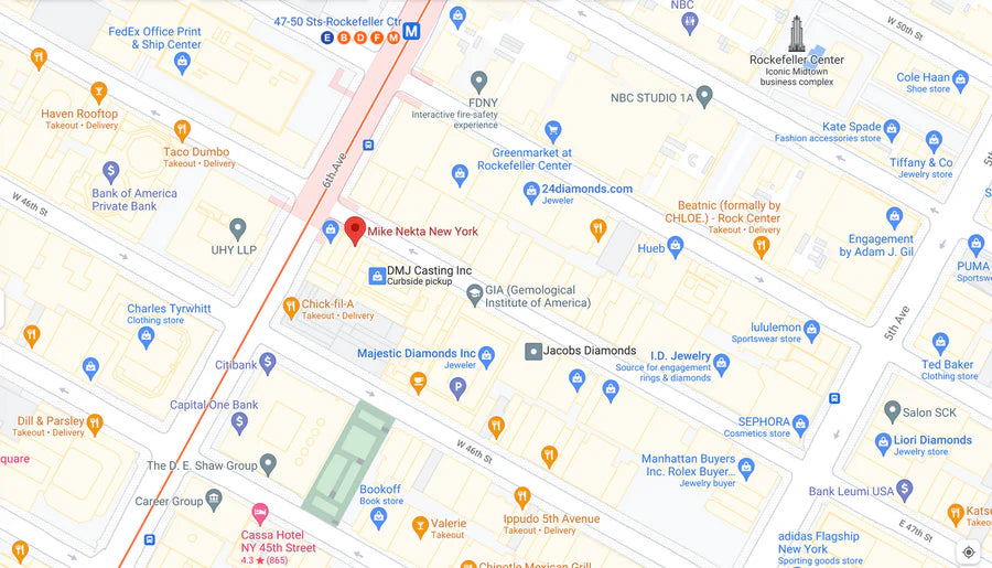
That’s why I invite you to book an appointment with me, Mike Nekta, at Mike Nekta New York.
When you come in, we can compare Asscher cut diamonds side by side so you can actually see:
- Cut quality and the hall-of-mirrors pattern
- Real-life color in different metals
- Clarity and transparency (what your eye notices, not just what the report says)
- Proportions and face-up size on your hand
- Setting options that protect corners and enhance the geometry
I’ll walk you through the details that matter for your style, your budget, and durability for everyday wear. If you want an Asscher that feels perfectly balanced, this is the fastest way to get there.
Book an appointment with me, Mike Nekta, at Mike Nekta New York to view Asscher cut diamonds in person and explore ring designs tailored to you.